
Game UX Review: Overwatch 2
December 2022 - Version 2.2.1.1.109168
Genre:
FPS: First Person Shooter
Mode:
Multiplayer
Tools used:
Photoshop, Miro, NVIDIA Experience In-Game Overlay Recorder
What is Overwatch 2?
Overwatch 2 is the sequel to Overwatch 1, a first person shooter (FPS) with a variety of cooperative, team-based player-versus-player (PvP) modes and a competitive 5v5 multiplayer scene. Within the game, there are a variety of heroes to choose from; each hero has their own unique role and abilities that help propel your team's objective.
Why Overwatch 2?
Competitive PC first person shooter games have always been a part of my life, I am drawn to the fast paced, strategic team-based games where I can progressively work on aim, site execution, and overall enjoy playing on a team with my friends.
With over 500+ hours of gameplay, 1.5 years playing on an Overwatch esports team competitively, and a little over 40+ hours of gameplay in the recently released sequel, I have chosen to do a game analysis of Overwatch 2 (OW2) through a UX lens and compare and contrast some of their elements from OW1 to OW2.
Gaming Platform:
PC
Skill Rank/Progress Changes

One of the major changes from Overwatch1 to Overwatch 2 is the rank system. In the original game users were able to see their 'SR' (Skill Rating). This SR was visible on three levels:
-
Current SR
-
SR earned earned after a competitive match
-
SR needed for your rank-up
Earned SR
SR needed for rank-up
Current SR
Overwatch 1
This allowed for a simple tracking system that helped users gage their progression over time. Being able to track your own progress allows for more transparency and motivation towards playing competitive.
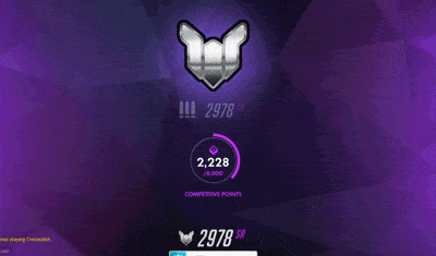
In Overwatch 2, the rank system went through a rework in terms of transparency and progression stages with users. SR is now removed from the players view and is now a 'hidden SR'.
The rework ranking system focuses on:
-
Current rank
-
Win rank progress
-
Rank reward after 7 wins

Overwatch 1 rank system is tiered and begins at Bronze and ends at Top 500. Users need a certain amount of SR to reach each rank.
This new visual system is represented with a progress bar that only shows the user their win progress in a visual graphic format, without any form of numerical system or percentiles from your rank progress.

After completing 7 wins,
the user is rewarded with their updated rank icon.
Overwatch 2
Overwatch 2 rank icons and tiers stay the same, while the SR is now hidden.
Issue:
New progress system showcases your 'games won' logs in the progress bar, while your 'games lost' matches are not logged visually. Users must then win 7 games to receive an updated rank that can either:
increase, stay the same, or decrease.
Users often have to play 7+ matches that last an average of 15 minutes each (if the user is losing games they will be playing more than 7 matches) to receive their rank until they reach the 7 win goal. If a user plays 12 matches and and receives a decrease in rank that can be very disheartening.
The lack of visual progression in your skill rating after each won/lost match removes:
-
Motivation since users have to wait several matches and countless hours to receive their new rank that determines their skill for that period
-
Confusion in knowing if their performance and skill is progressing in the right direction after each match.
-
Engagement will be low because users feel a lack of reward after each match, as well as waiting several matches to receive their new rank that determines their skill.
Modification:
Taking into consideration the system that is already in place and not reworking the whole rank progression system. My modification involves keeping the milestone card system and adding a section within the card where users can view their rank icon after each win while still keeping the loss logs hidden. This allows users to have a clear understanding about their progression, creates a positive user/game transparency. I have also changed the visual hierarchy of the information within the card spotlighting the current rank above the written information.

Medium fidelity mockup of new competitive progress system.
Main Menu Overview
Issue:
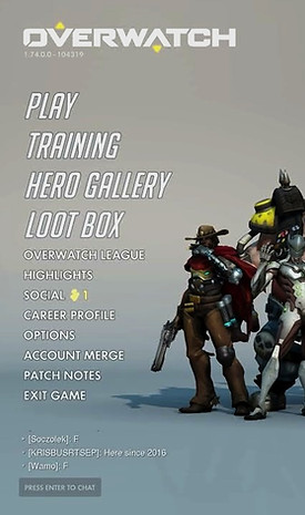
There are multiple instances where duplicated design decisions create a lack of clarity and complexity within the menu system. One example is the 'Challenges' button located in three locations within the same menu:

Modification:
I would remove the large advertisement for the Battle For Olympus/Go To Challenges button and replace it with an 'in-game notification' that appears after launching the game and right before you are greeted by the main menu. This feature would allow the users to be informed about the new challenges and remove the clutter and repetition from the menu screen.
Issues:
Using Gestalts principal of similarity, the 'enter chat' button is designed in such a way that the 'enter' and 'chat' text do not seem like they are related to each other and seem to be part of two different functions. They are grouped in two different sections but both have the same option once you click the 'chat' text with your mouse or click enter on your keyboard.
Modification:
The fix for this is fairly simple: by using Gestalts principal of similarity and creating a clear relationship between the 'enter' and 'chat' by grouping both words within a single button and keeping the labeling consistent with the same text size/line thickness.

Comparison:
Screenshot comparison of their previous button in Overwatch 1. As we can see, they previously used a single button and consistent labeling.
1• Main menu located on the left of the game screen.
2• Challenges button is now represented as a symbol
3• "Go To Challenges" button below the Battle For Olympus graphic.
4• Within the submenu there is a challenge tab as well.
Modification:
A modification wo would be to remove the 'ESC/MENU' button and add an OPTIONS button to the main menu list located on the left side of the game screen. Using the model of visual hierarchy, this helps give priority and importance to the OPTIONS button, as well as keeping the continuity of the name 'OPTIONS' instead of 'MENU' from Overwatch 1 to Overwatch 2
Issue:
There is no 'Options' button in the main menu, instead, they added a menu button that acts as a sub-menu (bottom right hand corner). The options button is a vastly utilized menu button that every user uses for a multitude of reasons: video and audio configuration, remapping keys, accessibility and so forth. This change creates a non intuitive menu system that confuses players.
Comparison:
Screenshot of Overwatch 1 'OPTIONS' location.

Modification:
A modification for this issue would be to include a "Main Menu" button or "Home" button within the sub-menus so that users can easily navigate back to the main menu without having to click the "ESC/BACK" button multiple times.
Issue: Navigation/Extensive Clicking
While exploring menu options like the Leaderboards section, users can expect to have a click depth of around 4-6 clicks. The issue presented is when a user wishes to go back to the Overwatch 2 'Main Menu' after 4-6 clicks, there is no option to go straight to the menu. The user must click ESC/BACK 4-6 times to get back to the main menu.


Thank you for reading my game analysis of Overwatch 2!
For this article I analyzed some elements of overwatch 2 through a UX lens. One of the main reasons for selecting Overwatch for my game analysis was the connection I have to the game and to the Overwatch scene. This game has connected me to many wonderful people, experiences, my first esports team, and my first LAN Tournament with my old Overwatch team: Sailor Scouts. I hope you enjoy this small keepsake gallery from our LAN ETS Tournament and events.

