Maple Bank
My Role:
Research, Persona Definition, Ideation, User Testing, Low/medium/high-fidelity wireframing and Clickable Prototyping
Timeframe:
2 weeks
Project type:
UI/UX: Team of 3, student project
Tools used:
Figma, Miro
Overview:
Maple Bank is a neo-bank that is looking to reach a new market base and wants to offer a service that their current website and app does not target. We were assigned to develop a Registered savings and goals application.

Design Thinking Process
Audience:
The CIO has already prepared data on their current customers and potential customer personas. Of the personas, we chose to build an app for people over 30 years old and not male-identifying (currently 32% of customer base).
Scope and constraints:
Our final UX project was a team-based project, composed of myself and two other classmates. We were given 2 weeks to complete this project that involved research (competitive analysis, journey map, empathy map, storyboard), ideation, design low-medium-high fidelity, user testing, and a clickable prototype. All members were heavily involved, and we would meet 4 times a week, with daily sprints.
Our constraints were the short time period given for this project, the time constraints with working full-time and creating a full app, and learning to make a clickable prototype.


Empathize
-
Competitive Analysis


Competitive Analysis:
We analyzed three big banks (Desjardins, BMO, RBC) and a popular neo-financial tech company (WealthSimple). We highlighted areas that would be advantageous for Maple Bank's new application and areas that would hinder the user experience.

1. Icons represent the bank brand, voice. Icons communicate meaning and are recognizable.
2. The information icon "i" allows for extra knowledge and education around registered savings accounts. This allows new users to get more information while users with experience can continue through the app without being pestered with this information.
3. Projected saving visuals that are intuitive and adjustable for future growth.
1. BMO and RBC offer very information heavy screens throughout their application. This can be a barrier for users (neurodiverse users, or if they are lacking time). Information icon should be used more liberally

Define:
-
Empathy Map
-
Journey Map
-
HMW Questions
Empathy and Journey Maps

When looking through our key customer facts and data we aimed to target data points that allow us to reach new customers. To address this, we believe choosing Monique’s persona allows us to reach customers that are above the 30 age, as well as reaching customers who aren't male identifying which is built up of only 32%. Giving users that encompass Moniques persona a reason to join MapleBank
With the information we gathered, we asked ourselves HMW questions:
HMW help busy, self-determined users financially plan and understand their savings for their own and their family's future?
Answer: By designing a registered set-and-forget goal savings app.
.jpg)
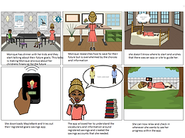
We then moved onto identifying Moniques journey when downloading a savings app. This allowed us to empathize with her thought process and behavior during her journey. Accompanied by 2 storyboards that allows us to visualize her steps; from both a short term journey to a long term journey where she can use her goal savings for her children’s education.

Ideate:
-
Storyboard
-
User Flow
Storyboards


User flow chart

Sketches
Using stars we highlighted the features we wanted to keep in our savings application.

.jpg)

Prototype:
-
Wireframes
Low Fidelity Wireframes
After the first iteration of these wireframes, we conducted user tests. The main changes were app flow, account registration, icons, and vocabulary. By the third iteration, we lengthened the onboarding process.


High-Fidelity


Test:
-
Usability Tests
-
Iterations
In order to validate our concepts, we conducted 6 user tests to pinpoint user challenges, app usability, and user pain points. Biggest challenges that we noted in our user testing:
1. App Onboarding: Lacked a clear understanding of what the users will be expecting in the application as a whole, and simplifying and creating a more comprehensive onboarding experience.
2. Bottom navigation and icons: Icons within our “Goal Selection” page and our bottom navigation were not harmonious enough. Two icons created some confusion to what they represented.
3. Users were initially confused by the “accounts” icon and what it meant. There was also hesitancy and uncertainty on how the accounts flow page functioned.
4. Our first approach to the statistics goals page had a hierarchy issue that didn’t showcase the important information that the users needed.
Our team went through several iterations and usability testing's. In the end we were able to validate the overall concept and design


Additional screens for a more clear understanding of the application


Key Changes?
1. Onboarding: text clearly and simply explains what the user will expect in the application right after app launch. Further onboarding screens were added to demonstrate what a users projected stats could look like and more guidance within creating an account and connecting their bank.
2. Bottom navigation and icons: We created our own icons within the bottom navigation, as well as our own user goal icons to better represent their meaning.
3. “Accounts”: We removed the accounts page and altered the flow of to the "Home" icon.
4. We changed the hierarchy of the stats page to really emphasize the important information that grabs the users attention.
Final Screens
zoom in using the Figma plugin
Styling Guide: Colours, Icons, Type

Our main goal was to have a comprehensive set of colors that passed the accessibility checker website, as well as selecting colors that can sway the user's mood in a positive way.
We chose the color Orange tinted yellow and a Palm green. These colors bring out confidence, opportunity, warmth, and growth. All aspects that we believe a bank app should strive for.
For our font selection we decided on a modern, clean, and easy to read font pairing of Inter Semi Bold and Source Sans 3.
After spending quite some time trying to find icons that represented their respected function. We decided to create our own icons and illustrations from scratch.
It was my first time creating icons and illustration via Figma. Quite proud of how they turned out. Banking in general can be daunting and stressful and it is often seen with cold cookie cuter images. We decided on a fun, loose, and minimalist illustration style to represent our icons and imagery.


Our Maple Bank logos had multiple iterations, after each user test we would ask the users a few questions about logo branding and colors. Our logo user tests helped us validate the colour and style.
CONCLUSION + LESSONS LEARNED
The Maple Bank project proved to be the project where I valued every challenge and learning point that came our way. This project in particular allowed us to value the finer details in creating an application from scratch.
I thrived in design thinking, ideation, and creating multiple iterations of our wireframes from several rounds of usability test. There was some trial and errors in our onboarding flow and in creating a positive, but thorough onboarding/user relationship. If time permitted, we would have explored and documented more applications in our competitor analyses and examined how other companies optimize their onboarding process. As well as taking a step back and re-evaluating what makes sense and is comprehensive for users who have never used a banking app before.