Freshly Dropped
My Role:
UX design, Research, Persona Definition, Ideation, User testing, low/medium-fidelity wireframing.
Timeframe:
2 weeks
Project type:
UX: Team of 4, student project
Tools used:
Figma, Miro
Overview:
Freshly Dropped is a meal box service that delivers fresh items to your doorstep that allows everyone and anyone to prepare healthy and delicious meals at home.
The CEO of Freshly Dropped has asked us upgrade and expand their current recipe app to feature an additional functionality of meal box and ingredient delivery. This new functionality should be the main focus of the application, while keeping secondary functionalities like generating a grocery list available to their customers, while still keeping the 'fresh vibes' feel for the app.
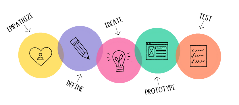
Design Thinking Process
Audience:
Our research showed us that the targeted audience who have a stable income and live alone or with roommates tend to order ingredients online more often. A typical user had a robust work and social life that they balanced. They are also digital natives and use food related applications weekly.

Scope and constraints:
Our second UX project was a team-based project, composed of myself and three other classmates. We were given 2.5 weeks to complete this project that involved research, ideation, design low-medium fidelity, and testing. All members participated in every step involved in this project, and we would meet 3 times a week, with daily updates via Discord of our progression.
Our constraints mainly fell within the short time period that this project was given, coupled with the time constraints around working full-time and learning the ins and outs of Figma, created some interesting challenges. Although, this did not hold us back! We would motivate each other, keep each other accountable, as well as endless laughs to keep up our moral during our evening meetups.

Empathize
-
Competitive Matrix
-
Competitive Analysis
-
User Interviews


Competitive Analysis:
In order to reach our project goal we needed clear and concise insight on how to optimize fresh ingredient deliveries and a simple and hassle free grocery list.
Our competitor matrix, competitor analyses and structured user interview results led to some prominent findings.

Competition Matrix Template
1. Most existing competitor apps are hidden behind a pay wall.
2. Too much visual clutter and not enough spacing within the menu system.
3. User questionnaire was given on onboarding, allowing for a more personalized experience.
4. Recipes and grocery list have clear information and high definition visuals for each item.
User Interviews:

Key findings from my user interviews

1. Users noted that they enjoy in person and online browsing equally, as long as their goal of obtaining fresh produce is met and locating the ingredients is simple.
2. Users were split between using their phones notepad to write down their grocery list or handwriting it. Users who had a digital list enjoyed a checklist option to shop with ease.
3. All the users mentioned that there is some produce that they would rather pick up themselves in person; worry of it not being fresh but often order ingredients online that aren’t as perishable.
4. Users who occasionally shopped in person noted that they did not enjoy spending too much time searching the aisles for their ingredients.
5. Users noted that they are interested in additions to the grocery apps that they currently use; a grocery list function that was easy, clear and helps with navigating ingredients in the store, as well as a more comprehensible checklist.

Define:
-
Persona Definition
-
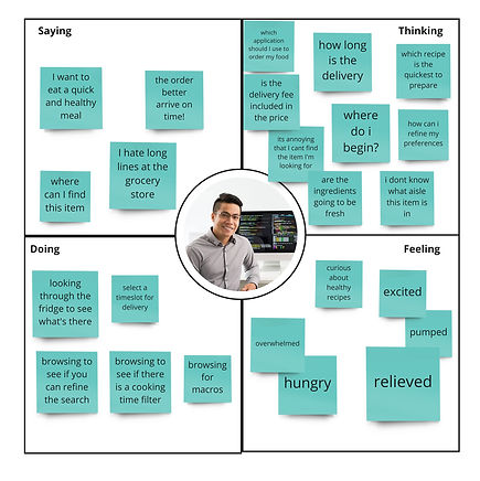
Empathy Map
-
Journey Map
-
HMW Questions
Empathy and Journey Maps

Our research showed that users who have a stable income and live alone or with roommates tend to order ingredients online more often. A typical user had a robust work and social life that they balanced. They are also digital natives and use food related applications weekly. Users who fall within these characteristics used a recipe app or grocery delivery app at least once a week and stayed loyal to the same service.
Thus, we came up with the persona of Kay, a young working professional in tech with a bustling social life outside of work. Active both in person and online, he is adept at using phone apps to create a more time efficient day to day living.
Based off of Kay's persona, we created an empathy map and journey map of a young programmer, looking to find an app that helps him plan out healthy meals and generate a quick and fresh ingredients and easy to navigate grocery list from the app.
Going deeper into his map, we have noted that when our user creates a premade list of ingredients for his grocery run or receives a confirmation of delivery for his meal kit ingredients there is a sense of relief, as well as satisfaction that his meal prep time was efficient.
The customer journey map breaks down his behavior into four phases, from the decision making phase of figuring out which app to deliver from, to the checkout phase where we noted that questions around freshness and delivery process we're still lingering. This enabled us to recognize the main pain points were experiences in phase 2 and 4.


With the information we gathered, we asked ourselves HMW questions:
HMW make the process of collecting ingredients for healthy recipes simple and clear, so busy users do not feel overwhelmed?
HMW optimize the grocery shopping experience for busy young professionals so that they can have time for their other priorities?

Ideate:
-
Storyboard
-
User Flow
Storyboards
As a team, to ensure we are all on the same path and that our insights to our user persona is aligned with the same goal, we all created a storyboard. Storyboards help narrate and visually showcase our personas journey through their scenario and experience with an emphasis on who, what, where, when, and how.

.jpg)

User Flow Chart
A user flow chart allows us to visualize the steps a user would have to take in order to reach their goal in the application, which in this case is ordering a meal kit with fresh ingredients. This step-by-step functionality blueprint allowed us to see how the new Freshly Chopped app functions.

Sketches
As a team, we fleshed out some quick ideas in a “crazy eight” brainstorming session, and highlighted areas and functionalities that we would merge in a final paper wireframe. The final paper wireframe allows us to have an expanded view of the app before creating our wireframes.


Prototype:
-
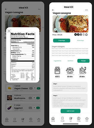
Wireframes
Wireframes: medium fidelity


Test:
-
Usability Tests
-
Iterations
After our first low-fidelity wireframes, we conducted 3 rounds of usability testing.
Our first round allowed us to observe the user and how they navigate the app, understood functionalities, completed the task of the end goal, and highlight key components that created challenges and confusion with their feedback.
Our first two user tests allowed us to change some key elements, while our third one allowed us to rest more assured that the changes were positive and functional.
Key Changes:

Final Wireframes:


CONCLUSION + LESSONS LEARNED
This was my first project in collaboration with other UX designers. I enjoyed how our multiple perspectives influenced the ideation process and how our different strengths came into play at various stages of the project. Learning Figma in three weeks to complement my work in this project was one of my biggest obstacles.